







Is 57 Inches Really Eye Level?
Everyone gives the same number and the same reason. The number is right. The reason is not — and knowing the difference is what tells you when to break it.
Ask how high to hang a picture and every answer says the same thing, in almost the same words. The centre of the work goes 57 inches from the floor — about 145 cm — because that is average eye level. Museums do it. Galleries do it. And a wall hung to one common line really does look composed.
The rule is good. The reason attached to it is not true, and one table is enough to see why.
The US Federal Aviation Administration publishes an anthropometric appendix in its Human Factors Design Standards — floor to the outer corner of the eye, standing. The median man's eye is at 165 cm. The median woman's is at 152 cm. Even the fifth-percentile man, shorter than ninety-five per cent of men, has his eye at 153.5 cm.
So 145 cm sits twenty centimetres below the eye of the median man and seven below the median woman. It is not average eye level. It is deliberately, consistently under everybody's — and the number comes from somewhere else entirely.
“Wall labels mounted between 1220 mm (48 in.) and 1675 mm (67 in.) are in a comfortable viewing location for both those seated and standing.”
Smithsonian Guidelines for Accessible DesignRead the two ends of that band and they name themselves. The bottom, 122 cm, is roughly a seated eye — the same guidelines put one between 109 and 130 cm. The top, 167.5 cm, is roughly the standing eye of the taller half of a room. The band is not a preference: it is the overlap between the two kinds of eye that will be in it.
And then the part nobody seems to have done out loud. Take its midpoint:
(122 + 167.5) ÷ 2 = 144.75 cm
Which is 56.99 inches. The rule everybody repeats is, to the second decimal place, the centre of the only published band for a comfortable seated-and-standing view. It was never eye level — and that changes what it is: not a target you hit or miss but a window with room in it. You leave the middle when something in your particular room asks you to, and the rest of this article is the list of things that ask.
How Old Is This Rule?
Younger than the furniture in most rooms. For most of the history of hanging pictures there was no line at eye level at all, because pictures were not hung one at a time.
At the Royal Academy in London a moulding ran round the walls of the great room at about eight feet — two and a half metres — and it had a name. It was the line, a painting was “on the line” when its frame met it, and that was the best address in the building. Everything above was skied: stacked towards the cornice, out of reach and, in practice, out of the conversation.
The wall above the line was even raked forward by some seventeen degrees, so that the skied pictures still faced the room instead of staring at the opposite ceiling. Height was not a comfort decision up there. It was a verdict, delivered in feet.
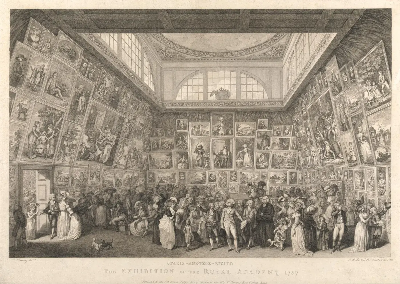
Pietro Antonio Martini, The Exhibition of the Royal Academy, 1787. Yale Center for British Art (CC0) — a real engraving, not a visualisation.
The single row at eye level is barely ninety years old. It arrives with modernism, and above all with Alfred Barr at the Museum of Modern Art in the 1930s. One row. Generous empty wall between the works. Each piece looked at on its own terms instead of ranked against its neighbours. And note where he put that row: just below eye level. Which is where we came in.
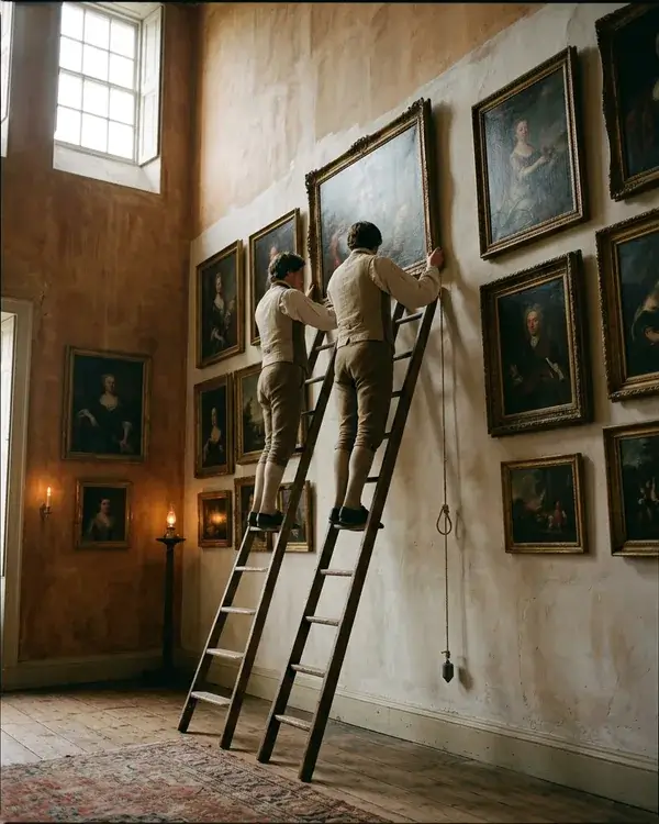
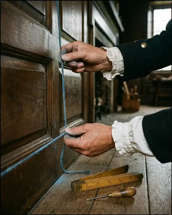
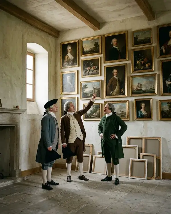
A plumb line, a chalked string and an argument. The Academy had no spirit level and no laser: the wall was set out by eye, by cord and by seniority — which is part of why the good places went to the people who already had them. These three are visualisations, not documents.
How Other Places Solved It
A strip of moulding in a London flat, a shallow alcove in a Kyoto house. Two very different answers to the same question — and both of them still useful.
The picture rail decided it for you. If you live in a Victorian or Edwardian flat, look up. That thin strip of moulding near the ceiling is a picture rail, and it was fitted as standard. It sits 30 to 60 cm below the ceiling, which in a period room means roughly 2.1 to 2.4 metres. Pictures hung from it on cord. Nobody drilled the wall at all.
But a rail is not a height. It is an anchor point. What decides where your work ends up is the length of the cord, and that is the part people get wrong. Hang short and tight to the rail and the work sits far above your eye — you have quietly rebuilt the 1787 wall in your own sitting room. Pay the cord out until the centre comes down to 145 and the rail has cost you nothing.
And anything on a cord leans forward
Hang from one high point and the work tips towards the room. The Academy did this on purpose. On a flat picture it is a nuisance you correct — but on a relief it is a lever. When a piece has to go high, over a staircase or under a sloping ceiling, a wedge of felt behind the bottom edge tilts the surface back towards you. It costs a little shadow, so tilt as little as you can get away with.
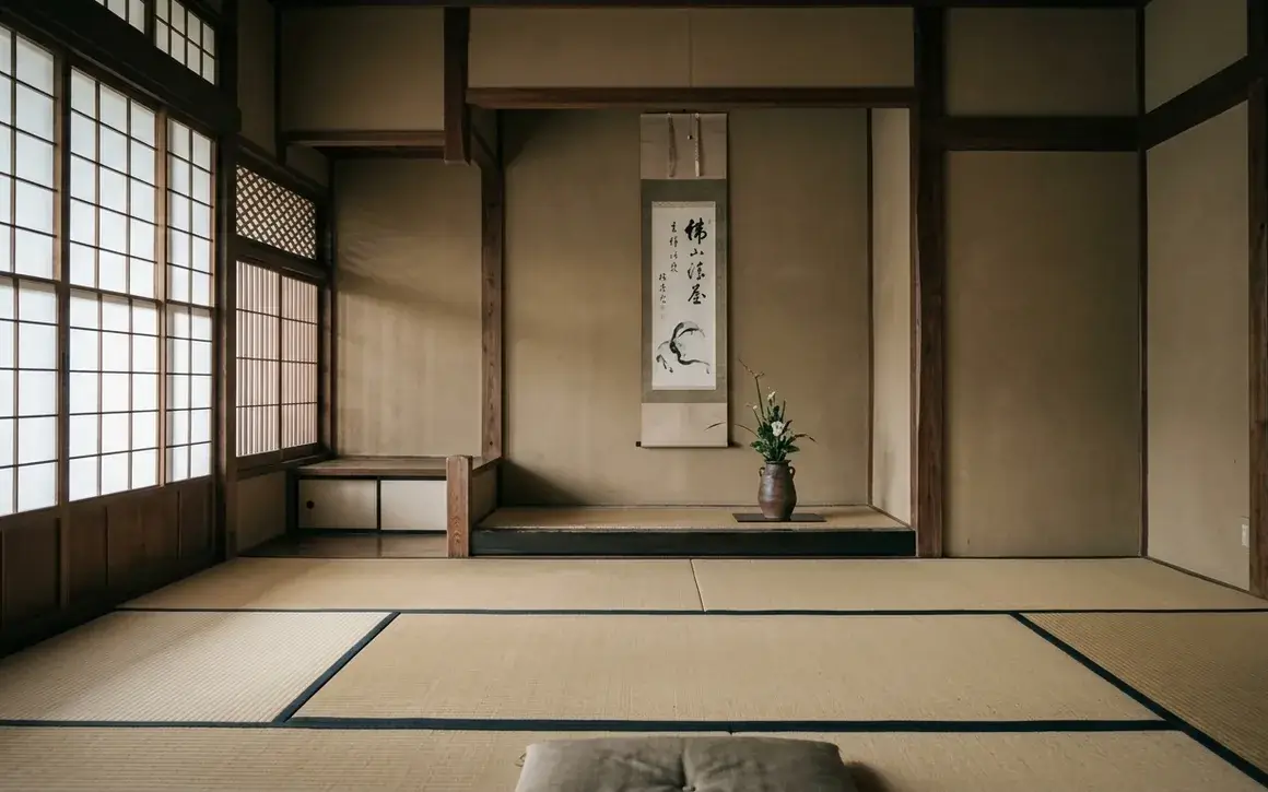
In Japan the room answers the question. The tokonoma is a shallow alcove holding a single scroll. The room around it is used from the floor, and the guest of honour sits closest to it. Nobody ever published a centre line, because the posture of the person looking decided it.
A scroll is also something you roll up and put away again. That is a very different relationship with a wall than a frame that stays put for twenty years. Closer, we think, to living with a surface that changes every hour with the light.
And the rest is units, not principle. We went looking for real national differences in how high people hang things. Mostly we found the same decision argued in different units: 57 inches on one side of the Atlantic, 145 to 150 centimetres on the other.
So Where Does the Nail Go?
Not at 145. That is where the centre goes, and the two get confused often enough to have produced a great many second holes.
Start at the centre. Go up by half the height of the work. Then come back down by the short distance between the top edge and the point where the hook rests on the nail.
That last number is the one everyone forgets. And the error it causes is not vague: the work ends up too high by exactly that distance.
Work out your own mark
Mark the nail at 169.5 cm.
The work will then run from 117.5 to 172.5 cm — 5 cm above the band and 4.5 cm below it.
Take the height you want for the centre, add half the height of the work, and subtract the drop from the top edge down to the hook. On a 55 cm panel with a 3 cm drop and a 145 cm centre, that puts the nail at 169.5 cm.
On a tall work, decide what «the centre» means first
On anything much taller than the band, the geometric middle of the panel is the wrong centre. What goes at 145 cm is the centre of what you want looked at. Find the passage you would miss most if it were gone. Put that on the line and let the panel land where it lands. Galleries do this with very large paintings and never explain it — which is why the rule feels broken the first time you try it on something big.
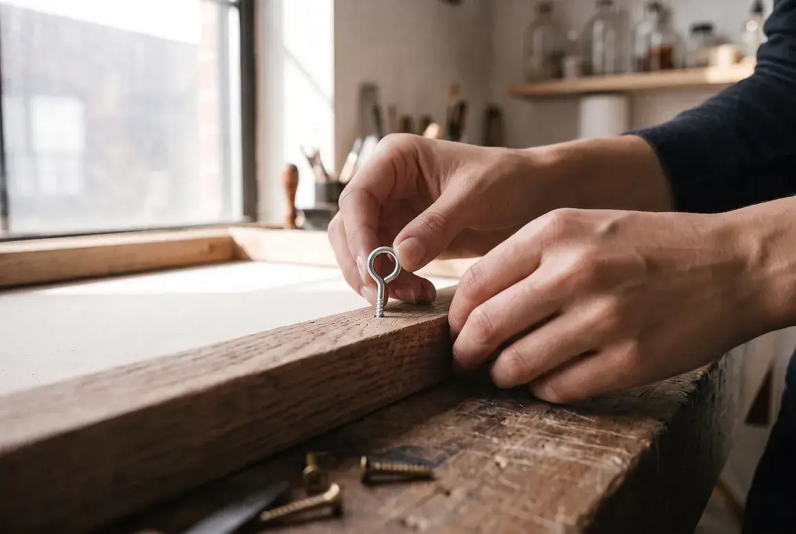
Two fixings, not one — and the second is what makes the sum exact. On a single hook a work turns itself crooked within a week. And with a wire, the drop changes every time you rehang it, because the sag depends on how far apart the nails are. With two fixings onto two nails there is nothing to guess. Measure once, top edge to the middle of the ring. Ours leave the studio with the two points already marked and pre-drilled in the stretcher bar, the one place the back of a piece has wood in it.
What Changes When the Work Has Depth
Everything so far is true of a flat picture. On a relief, height quietly carries a second job, and it is the larger of the two.
What makes a textured surface readable is the shadow, and shadow depends on how steeply the light hits it. Light from a ceiling arrives at a shallower angle the further the work sits below it. So the lower you hang the work, the longer every shadow on it gets.
Some numbers, from the setup we worked through in our article on lighting textured art. Ceiling at 2.70 m, spot set back 56 cm. A 3 mm ridge throws 5.6 mm of shadow with the centre at 165 cm, and 7.2 mm at 135. Same lamp, same wall, same piece: a 29 % difference in every shadow on it, decided by nothing but where you put the nail. Your own view barely moves by comparison.
So hang it where the room wants it and then re-aim the light, because you have just changed it whether you meant to or not. Lower lengthens every shadow, higher shortens them, and neither is wrong — knowing which one you just did is the point.
Does the Rule Change in a Café or a Hotel Lobby?
Homes, cafés, offices, hotel lobbies. The height barely moves between them — but what people are doing in the room moves a great deal.
Less than you would expect, and not in the way people assume. The height barely moves between a house and a hotel. What moves is the posture of whoever is in the room. The band was only ever a compromise between two postures. So when a room holds just one of them, the compromise is no longer needed.
Rooms where people sit. Dining rooms, cafés and restaurants, bedrooms, meeting rooms, the reading end of a lounge. The standing eye never arrives, so take the centre to 135–140 cm. Restaurant guidance goes lower still, towards the 122 cm floor of the band — a diner's eye sits almost exactly where the accessibility guidelines put a seated adult's. It will look low while you are standing there with the drill, and correct the moment you sit.
Rooms people only pass through. Halls, corridors, landings, the circulation side of a lobby. Nobody sits, so the bottom half of the band is wasted: 150 cm or a little above, and expect the work to be read from closer and at an angle. On a staircase there is no single floor to measure from — take each height from the tread directly beneath that piece and the group climbs with the stairs instead of sliding off them.
Rooms that do both. A living room, a hotel lobby with seating in it, an open-plan office. This is the case the band was built for, and 145 cm is the honest answer. The figure the hospitality trade works to is a centre between 1.2 and 1.6 m — the same band, with its corners rounded off.
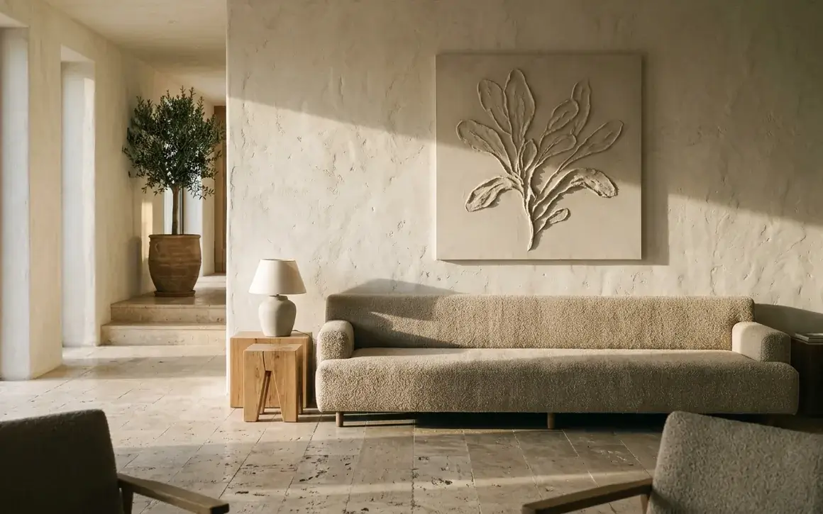
And rooms bigger than the people in them. An atrium, a double-height wall, a reception read from ten metres back: at that distance nobody's eye level is the constraint any more, the architecture is. Line the work up with something the building already owns — a door head, a window head, the line of a desk. What changes in a commercial space is rarely the height. It is the size, and the distance it is read from.
And everywhere, over furniture the furniture wins. A sofa, a sideboard or a banquette sets a hard floor for the bottom edge, and the working figure is 15 to 20 cm of wall between the two. If that pushes the centre above 145, let it: the centre line is only the tie-breaker for when nothing else in the room has an opinion.
What If There Are Already Pictures on the Wall?
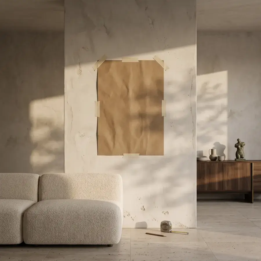
The commonest situation of all, and the one the rule handles worst. Two pieces near each other stop being two pieces.
This is the commonest situation of all, and the one the rule handles worst — 145 cm is advice for a work hanging on its own.
Two pieces near each other stop being two pieces. The eye reads them as one object and checks, before anything else, whether they share a line. There are three lines you can give them, and they do different jobs.
A shared centre line is that default, and the only one that survives works of different shapes: every piece has its middle at the same height and the edges fall where they fall. Use it on a bare wall.
A shared bottom line earns its place above furniture. A sideboard or the back of a sofa has already drawn a horizontal line, and a second one parallel to it reads as deliberate rather than lucky. It also flatters a row of small works.
A shared top line is the one to be careful with. It looks tidy on paper and unsettled on a wall, because it pushes the ragged edge down to the bottom — which is exactly where the furniture, and your eye, already are.
Two things matter more than which line you pick. The first: treat the group as one work. Find the outer rectangle the whole arrangement occupies, gaps included, and put its centre at 145 cm. And keep those gaps tighter than feels natural while you are stood there holding the pieces — 5 to 10 cm reads as one object, 20 cm reads as two.
The second saves the most work: if something is already up and cannot move, match it — even when its line is wrong. A wall hung to one shared line at 152 cm looks deliberate; a wall with one work at 145 and its neighbour at 152 looks like nobody was paying attention. Consistency beats correctness, and one existing nail decides the whole wall for you. The unit of consistency is the sightline, not the house: you can change the line completely in the next room, because nobody sees two rooms at once.
Four heights, four different decisions:
Hanging FAQs
The band does; the midpoint may not. On a 2.40 m ceiling a tall work centred at 145 leaves very little wall above it, and a piece that nearly touches the ceiling reads as though it were holding it up. Slide the centre down until there is a comfortable margin of wall at the top, and stop at 122 cm. And remember that lowering it lengthened every shadow on the surface, which on a relief is usually a gift.
On a flat framed painting, yes. On anything with relief in it, no — and the reason is height. The tube sits about 15 cm above the top edge and reaches 12 cm out from the wall. At the top of the work that is a steep, near-frontal beam. At the bottom of a 55 cm panel it is a 70 cm drop against the same 12 cm of reach — a beam running almost flat along the surface. The same 3 mm ridge throws under 4 mm of shadow at the top and around 17 mm at the bottom — 4.7 times longer, where a ceiling spot gives 1.6. The eye reads 1.6 as depth and 4.7 as two different works stacked on each other.
From Nature to Canvas
What do you do with an image you love and a surface you don't?
That was our problem long before any of it was about centimetres. We loved our images and not their physical expression: printed, flat, behind glass, finished the moment they left the printer. So we stopped printing them.
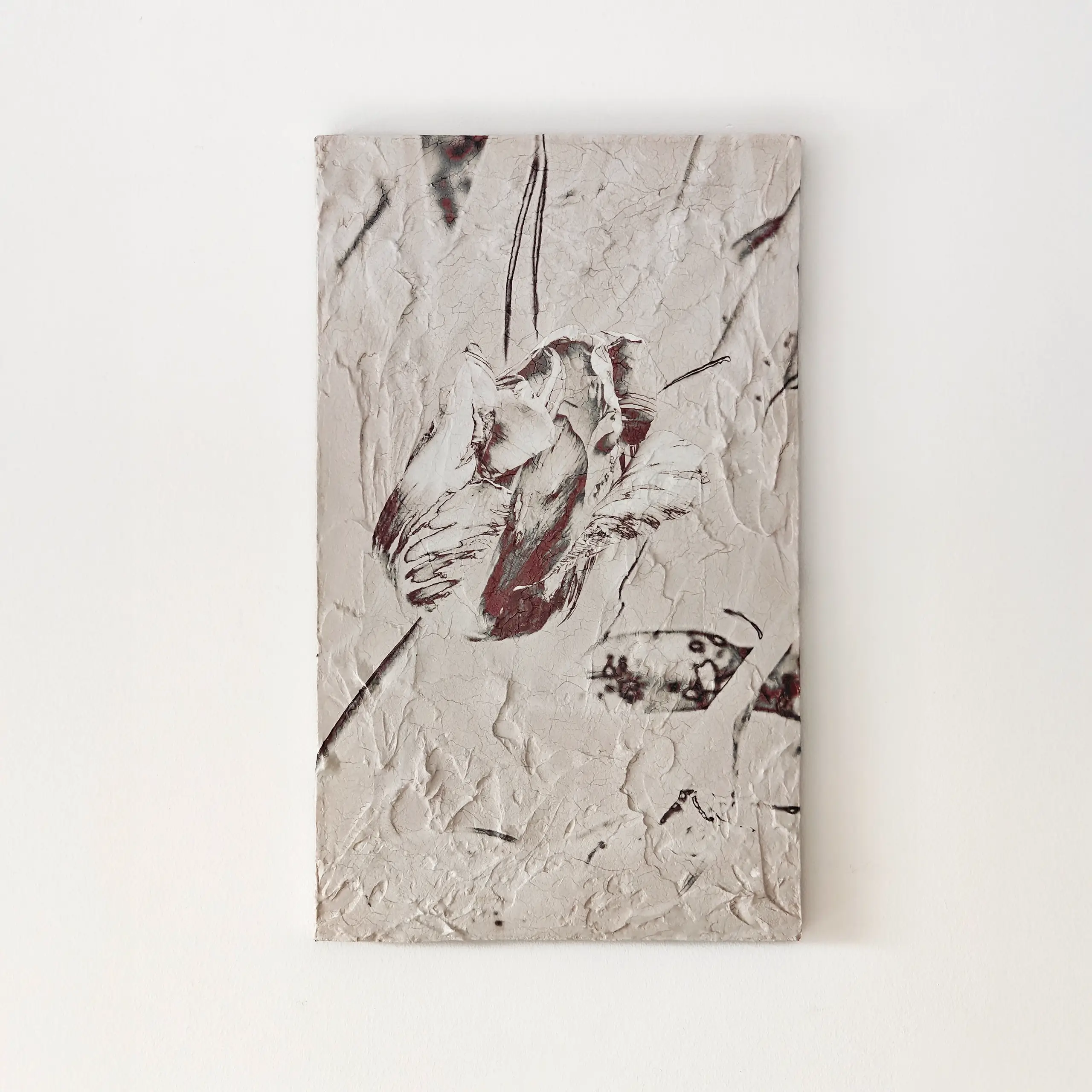
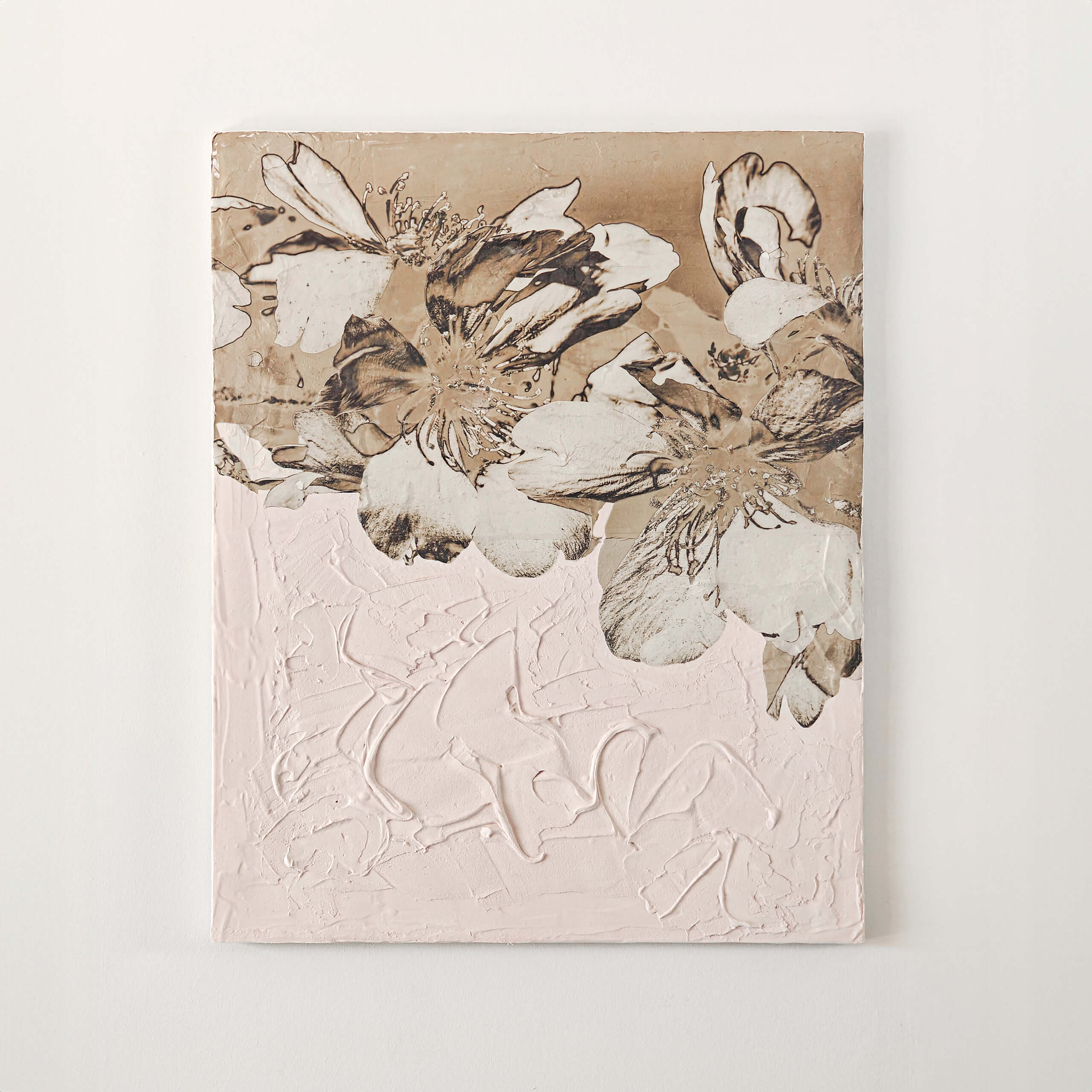
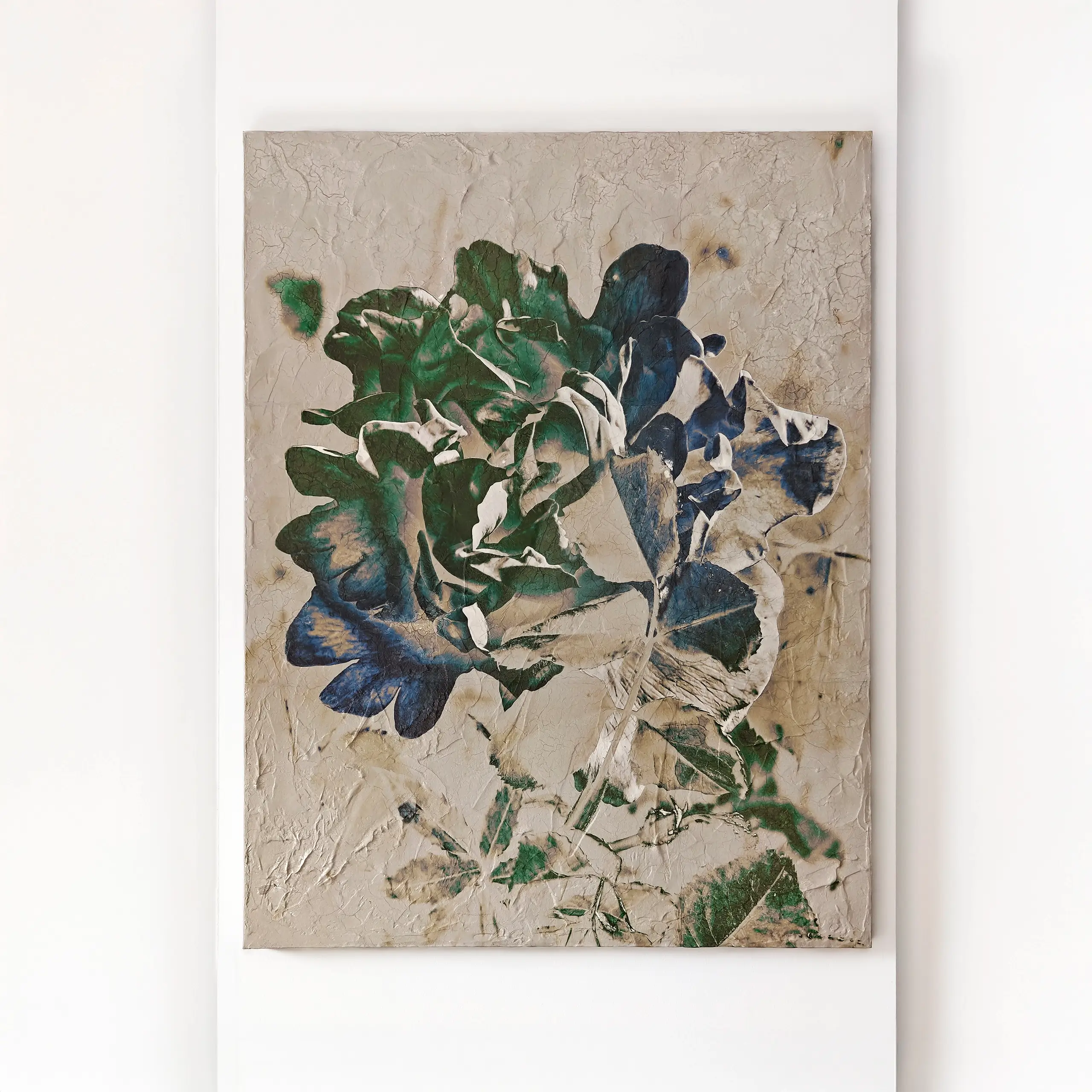
We work in photographic relief in plaster on canvas — the image transferred once onto a surface built to catch light and shadow, no paper and no layers. Which is why we are so exact about the back of the work. A surface like this is finished by the light that finds it, and the height you choose is half of that decision. The pieces are grouped by theme, there are rooms to look at in inspiration, and more about the two of us in about us.
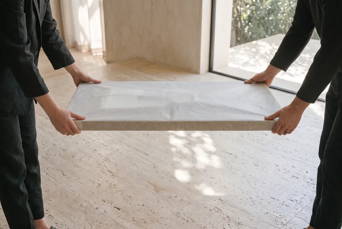
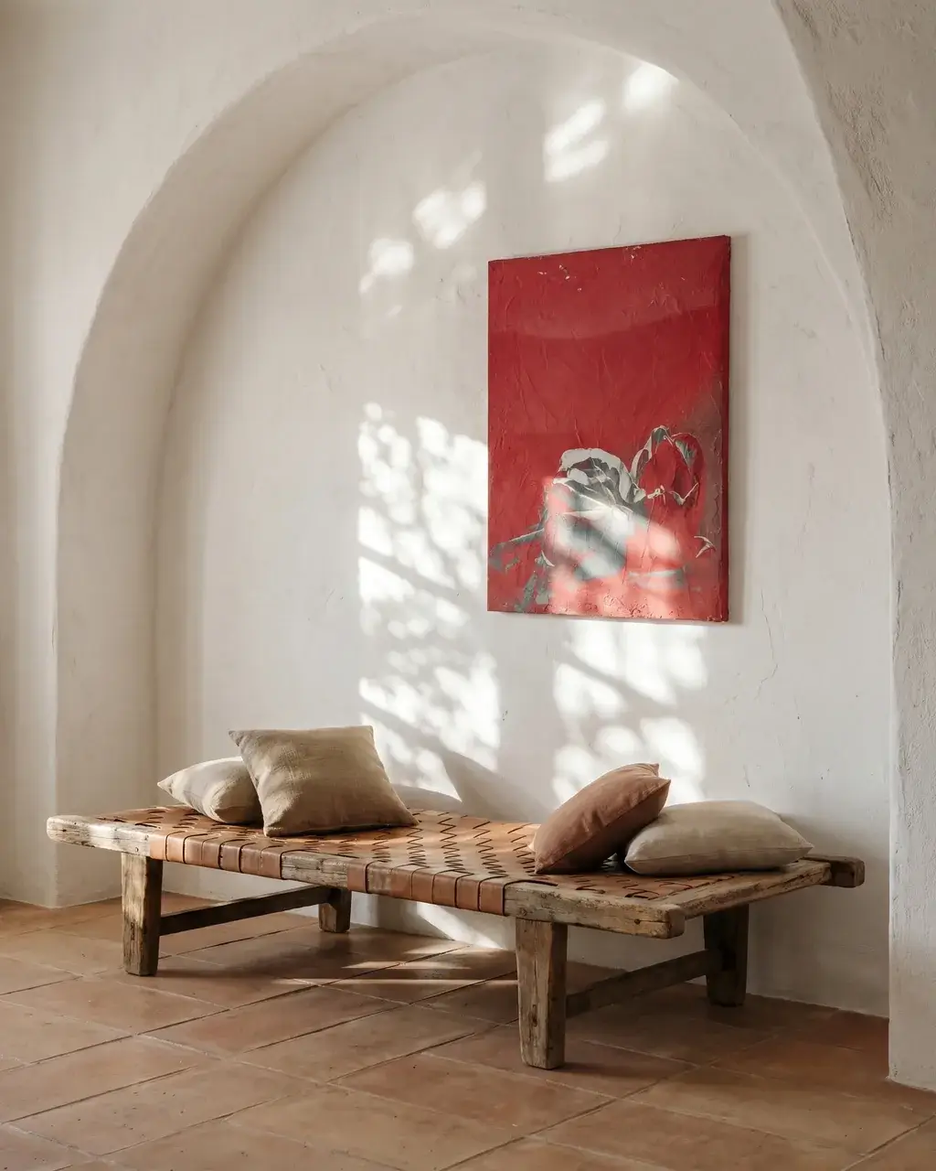
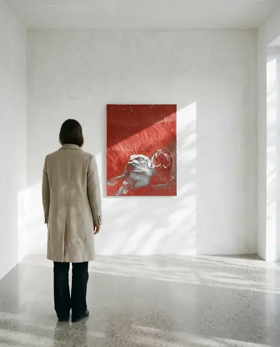
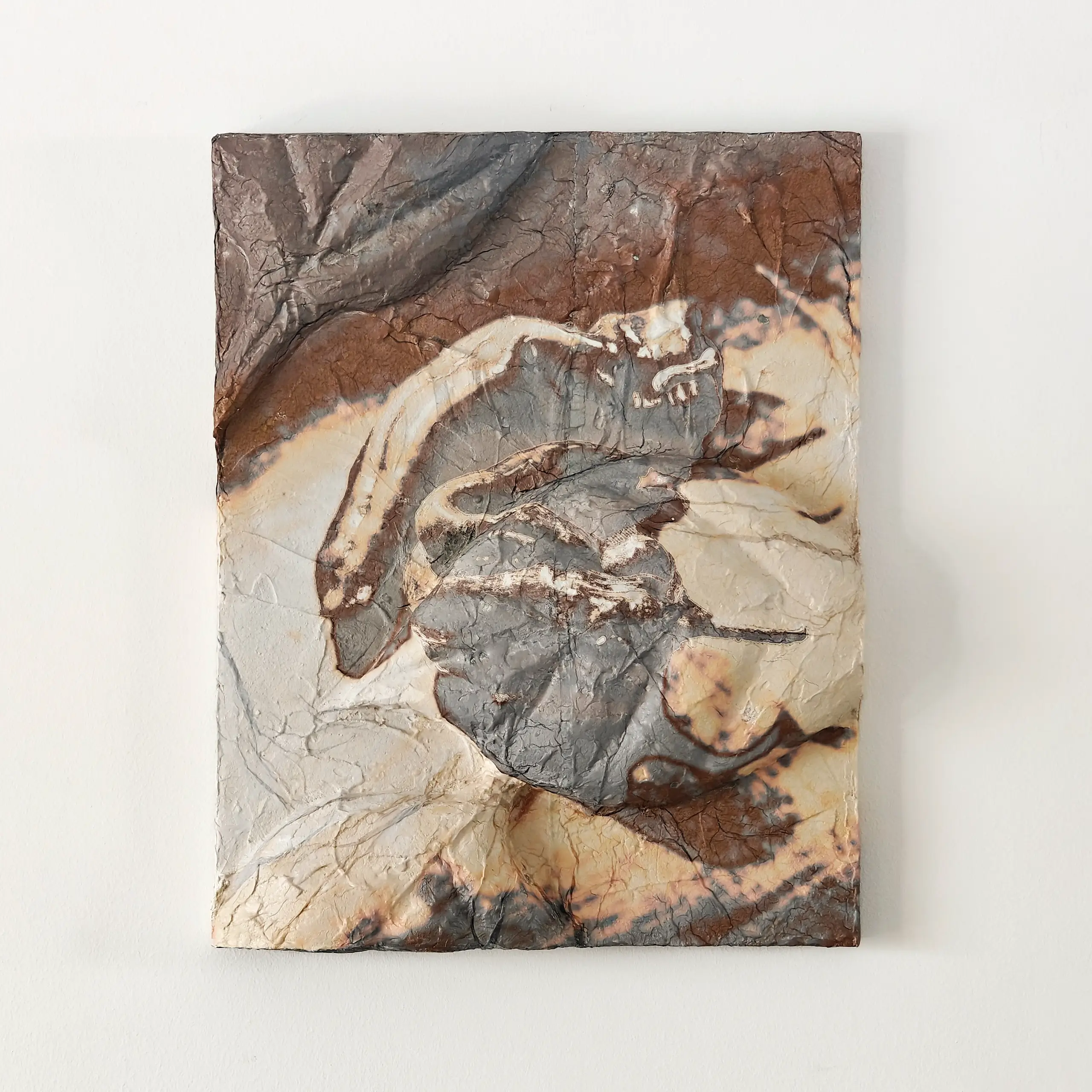
The room scenes on this page are visualisations. The four works above are photographs of the actual pieces.